Vignesh Vijayendran
Back to work
DESIGN SYSTEM / LIFEFIT
LifeFit Design System
A shared foundation for a growing fitness experience.
Built alongside LifeFit, this Figma system brings together role-based tokens, reusable controls and shared screen patterns for a fitness experience designed around adults above 40.
ROLE Solo Product Designer / TIMELINE Within the 2-month LifeFit project
SCOPE Foundations, component states, documentation and prototype integration
WHY A SYSTEM
From individual screens to repeatable decisions.
LifeFit spans assessment, planning, workouts and profile preferences. These flows need familiar controls and consistent feedback, rather than a new interaction language on every screen.
I built shared foundations and components alongside the product prototype, with the intention of making repeated design decisions easier to maintain.
01 / FOUNDATIONS
Make the visual language reusable.
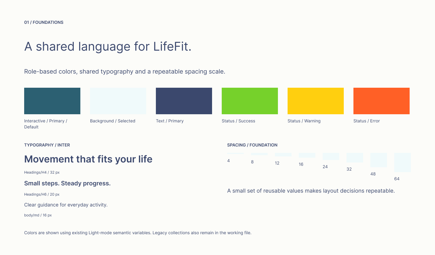
The library separates primitive colors from semantic roles and component-level tokens. Inter styles establish hierarchy, while a shared spacing scale supports repeatable layouts.
Explore the editable exhibit in Figma
02 / COMPONENT STATES
Define feedback, not just appearance.
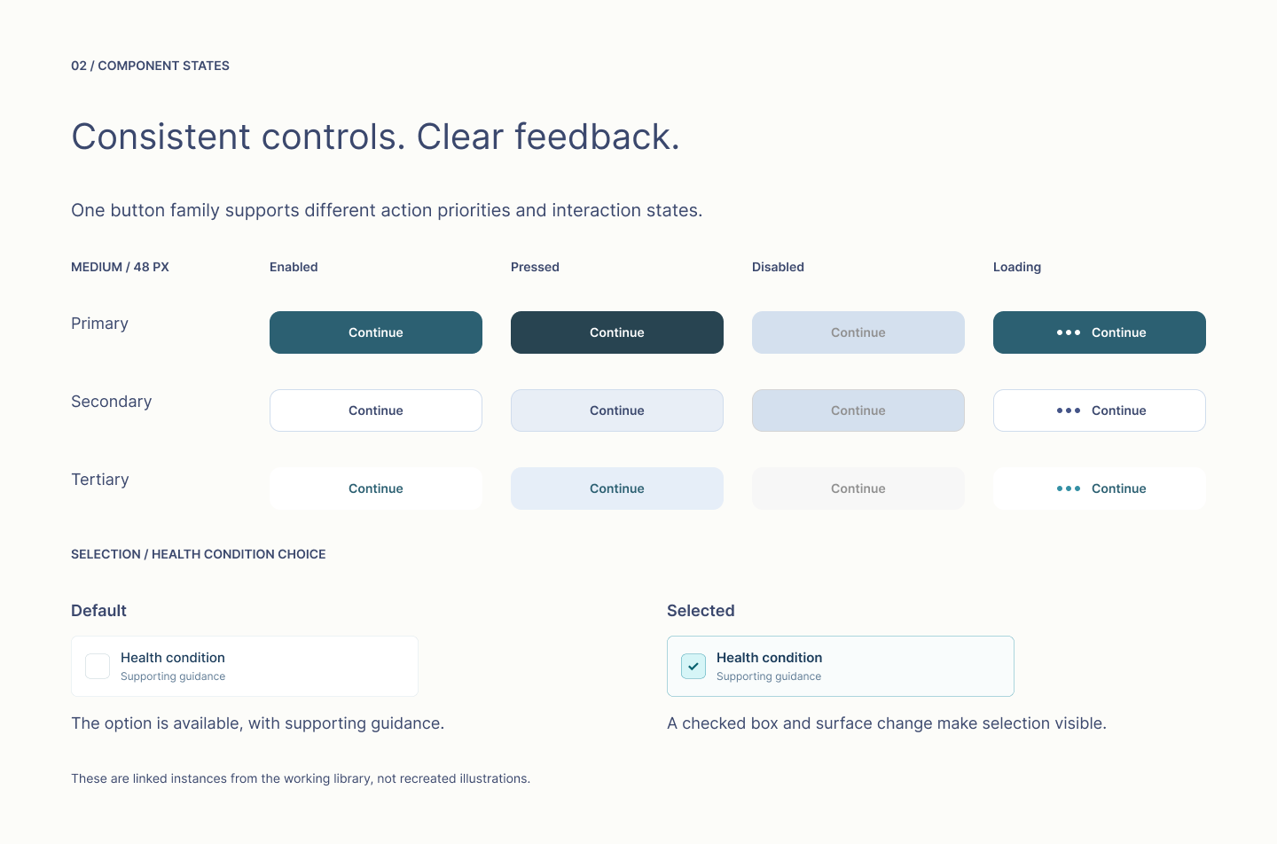
The button family includes primary, secondary and tertiary styles in medium and large sizes, with enabled, pressed, disabled and loading states. Selection rows pair a checked box with a surface change.
Explore the editable exhibit in Figma
03 / SYSTEM IN USE
Show the system working across screens.
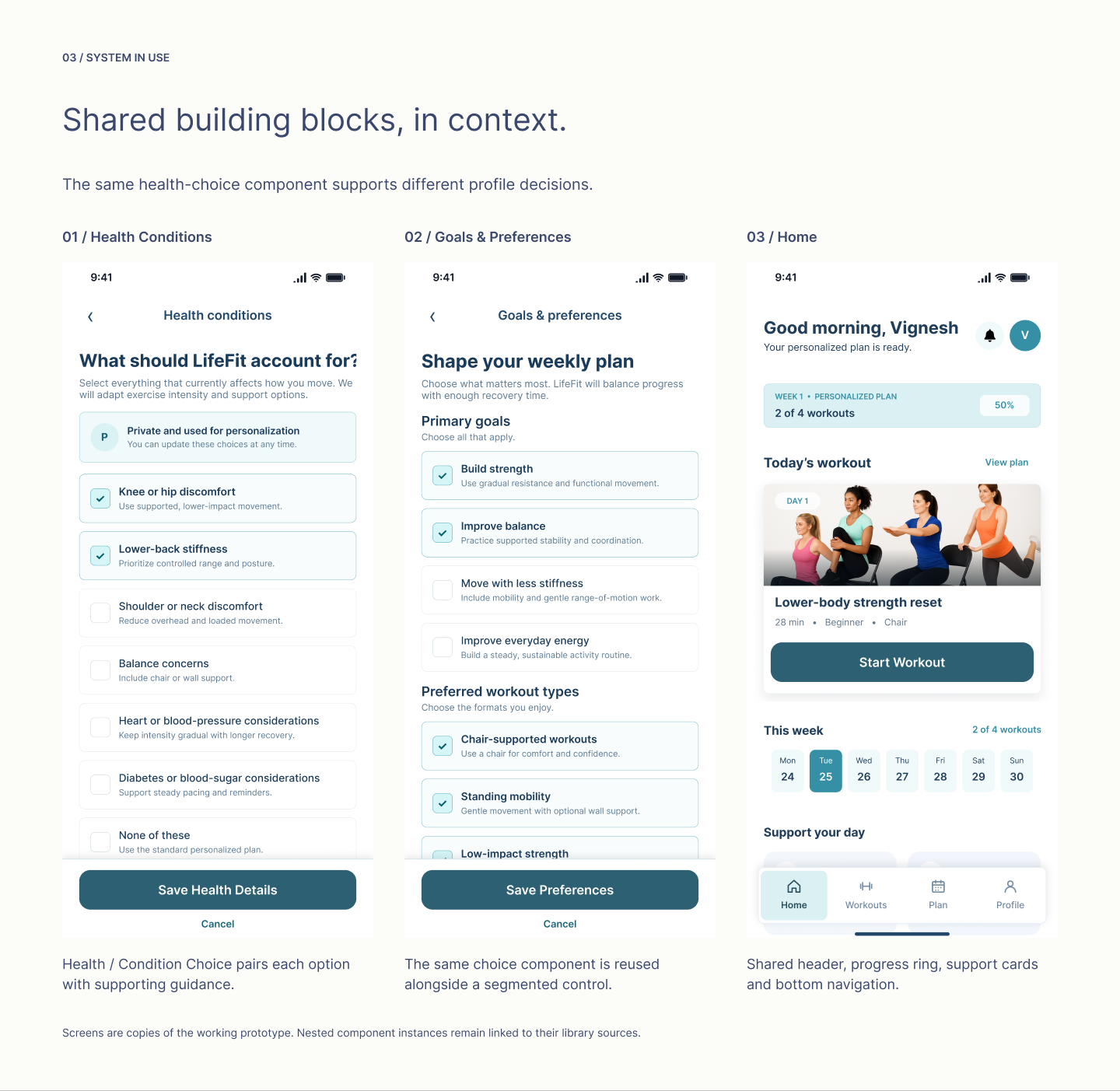
Health Conditions and Goals & Preferences reuse the same Health / Condition Choice component. The Home screen brings together shared headers, support cards, progress and navigation.
Explore the editable exhibit in Figma
REFLECTION & NEXT STEPS
A working foundation, with room to mature.
Building the system alongside LifeFit made it possible to apply shared controls to real product flows, rather than presenting an isolated component library.
What exists today
A Figma library of foundations, reusable components, documented states and patterns applied within the interactive prototype. This is design work, not a production-coded library.
What I would improve next
Consolidate legacy collections and duplicate patterns, extend variable bindings to remaining components, and validate readability, contrast, touch targets and interaction behavior with users.
Light and Dark variable modes exist, but full dark-theme coverage and accessibility compliance have not been verified. No time-saving or user-impact metrics are claimed.
THE PRODUCT BEHIND THE SYSTEM
Explore the LifeFit product story.
View LifeFit product case study
NEXT CASE STUDY
LifeFit Design System
Built for consistency. Designed to scale.
Vignesh Vijayendran / vignesh966@gmail.com
Back to work
DESIGN SYSTEM / LIFEFIT
LifeFit Design System
A shared foundation for a growing fitness experience.
Built alongside LifeFit, this Figma system brings together role-based tokens, reusable controls and shared screen patterns for a fitness experience designed around adults above 40.
ROLE Solo Product Designer / TIMELINE Within the 2-month LifeFit project
SCOPE Foundations, component states, documentation and prototype integration
WHY A SYSTEM
From individual screens to repeatable decisions.
LifeFit spans assessment, planning, workouts and profile preferences. These flows need familiar controls and consistent feedback, rather than a new interaction language on every screen.
I built shared foundations and components alongside the product prototype, with the intention of making repeated design decisions easier to maintain.
01 / FOUNDATIONS
Make the visual language reusable.
The library separates primitive colors from semantic roles and component-level tokens. Inter styles establish hierarchy, while a shared spacing scale supports repeatable layouts.
Explore the editable exhibit in Figma
02 / COMPONENT STATES
Define feedback, not just appearance.
The button family includes primary, secondary and tertiary styles in medium and large sizes, with enabled, pressed, disabled and loading states. Selection rows pair a checked box with a surface change.
Explore the editable exhibit in Figma
03 / SYSTEM IN USE
Show the system working across screens.
Health Conditions and Goals & Preferences reuse the same Health / Condition Choice component. The Home screen brings together shared headers, support cards, progress and navigation.
Explore the editable exhibit in Figma
REFLECTION & NEXT STEPS
A working foundation, with room to mature.
Building the system alongside LifeFit made it possible to apply shared controls to real product flows, rather than presenting an isolated component library.
What exists today
A Figma library of foundations, reusable components, documented states and patterns applied within the interactive prototype. This is design work, not a production-coded library.
What I would improve next
Consolidate legacy collections and duplicate patterns, extend variable bindings to remaining components, and validate readability, contrast, touch targets and interaction behavior with users.
Light and Dark variable modes exist, but full dark-theme coverage and accessibility compliance have not been verified. No time-saving or user-impact metrics are claimed.
THE PRODUCT BEHIND THE SYSTEM
Explore the LifeFit product story.
View LifeFit product case study
NEXT CASE STUDY
LifeFit Design System
Built for consistency. Designed to scale.
Vignesh Vijayendran / vignesh966@gmail.com
Back to work
DESIGN SYSTEM / LIFEFIT
LifeFit Design System
A shared foundation for a growing fitness experience.
Built alongside LifeFit, this Figma system brings together role-based tokens, reusable controls and shared screen patterns for a fitness experience designed around adults above 40.
ROLE Solo Product Designer / TIMELINE Within the 2-month LifeFit project
SCOPE Foundations, component states, documentation and prototype integration
WHY A SYSTEM
From individual screens to repeatable decisions.
LifeFit spans assessment, planning, workouts and profile preferences. These flows need familiar controls and consistent feedback, rather than a new interaction language on every screen.
I built shared foundations and components alongside the product prototype, with the intention of making repeated design decisions easier to maintain.
01 / FOUNDATIONS
Make the visual language reusable.
The library separates primitive colors from semantic roles and component-level tokens. Inter styles establish hierarchy, while a shared spacing scale supports repeatable layouts.
Explore the editable exhibit in Figma
02 / COMPONENT STATES
Define feedback, not just appearance.
The button family includes primary, secondary and tertiary styles in medium and large sizes, with enabled, pressed, disabled and loading states. Selection rows pair a checked box with a surface change.
Explore the editable exhibit in Figma
03 / SYSTEM IN USE
Show the system working across screens.
Health Conditions and Goals & Preferences reuse the same Health / Condition Choice component. The Home screen brings together shared headers, support cards, progress and navigation.
Explore the editable exhibit in Figma
REFLECTION & NEXT STEPS
A working foundation, with room to mature.
Building the system alongside LifeFit made it possible to apply shared controls to real product flows, rather than presenting an isolated component library.
What exists today
A Figma library of foundations, reusable components, documented states and patterns applied within the interactive prototype. This is design work, not a production-coded library.
What I would improve next
Consolidate legacy collections and duplicate patterns, extend variable bindings to remaining components, and validate readability, contrast, touch targets and interaction behavior with users.
Light and Dark variable modes exist, but full dark-theme coverage and accessibility compliance have not been verified. No time-saving or user-impact metrics are claimed.
THE PRODUCT BEHIND THE SYSTEM
Explore the LifeFit product story.
View LifeFit product case study
NEXT CASE STUDY
LifeFit Design System
Built for consistency. Designed to scale.
Vignesh Vijayendran / vignesh966@gmail.com